Little Studio takes Ønskeskyen global without losing its Danish heritage
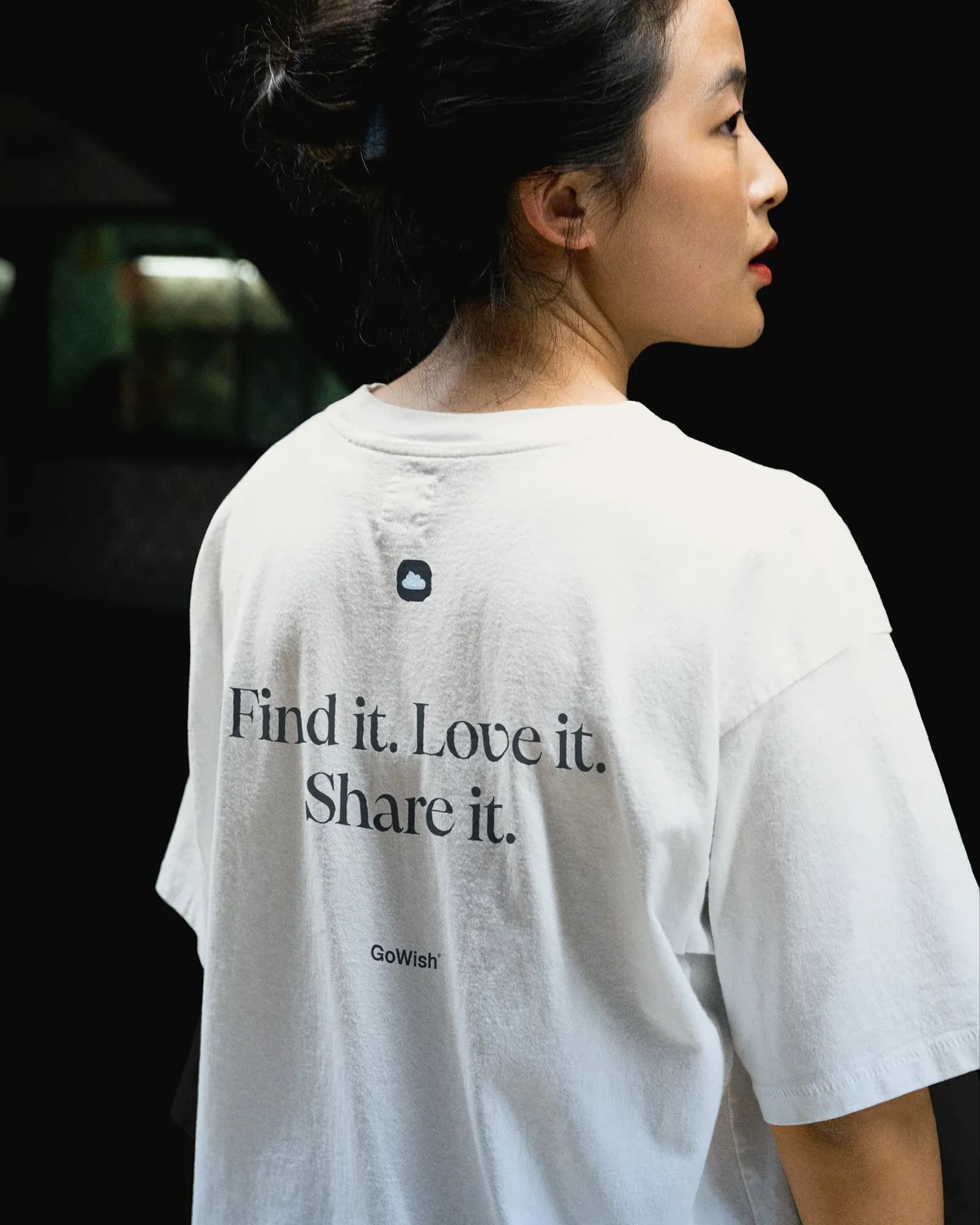
For a Danish wishlist platform that goes international, the question is what happens to the name and heritage at home: Ønskeskyen is the Danish service where users save and share what they want, GoWish is its international counterpart, and the brand they started from still carried visible ties to PostNord.
Aarhus-based Little Studio gave both names one shared identity. Nordic Brief interviewed Kasper Laigaard, Partner & Digital Design Director at Little Studio, about the strategy behind the shared typemark, the three design principles and how far personalisation can go before it breaks the master brand.
“The challenge was to preserve familiarity while giving the brand more personality, consistency and relevance throughout the year.”
Kasper Laigaard
From Danish wishlist to international brand
Little Studio describes the brief as three shifts: from a fragmented appearance to a coherent system, from wishlists towards discovery and inspiration, and from a Danish brand with PostNord heritage towards an independent international one. "GoWish had grown beyond its original role and target group as a wishlist tool, and the identity needed to reflect that broader ambition of global scale," says Kasper Laigaard.
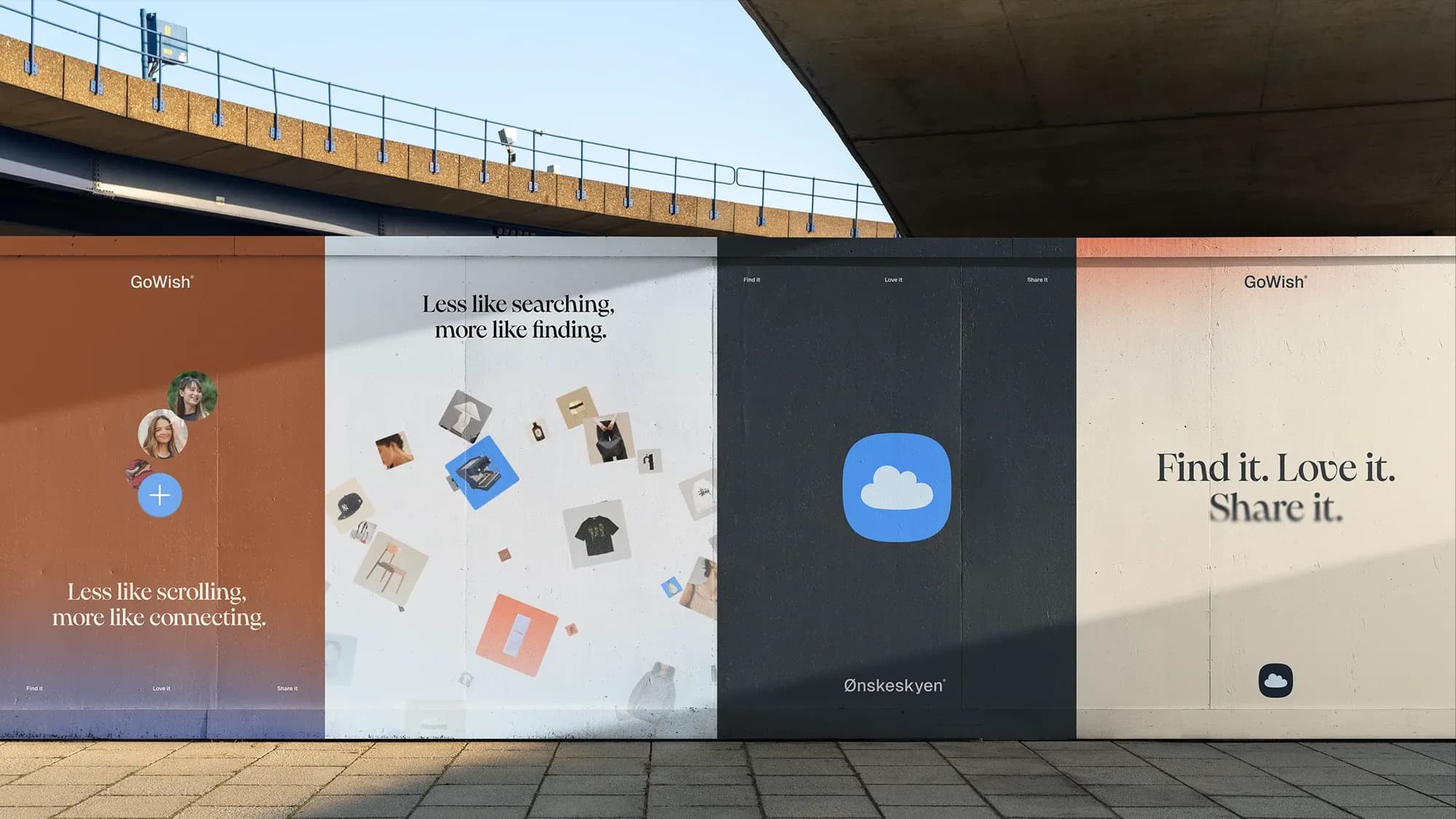
The studio worked with GoWish's in-house team from the start, and the question of two names was settled in the strategy phase. "The strategic rationale was international growth while not compromising the growth and heritage in the Danish market," says Laigaard. "So we agreed on a 'flexible' typemark so both names co-exist."
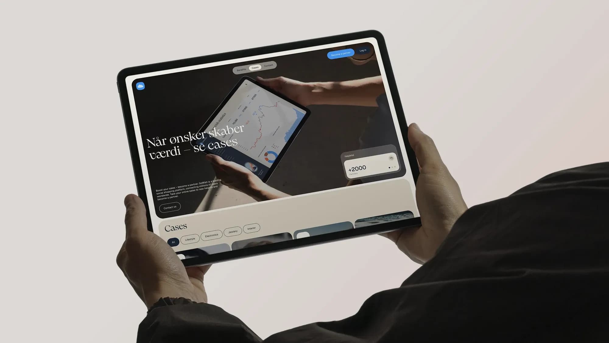
That decision set the terms for the design work. The identity had to hold two names, a Danish audience that already knows the brand and an international one that does not, and Little Studio organised the work around three principles: Playful, Personal and Professional.
“Playfulness and personality should make the brand feel engaging and approachable, without compromising clarity or usability.”
Kasper Laigaard
A cloud shape language and four user colours
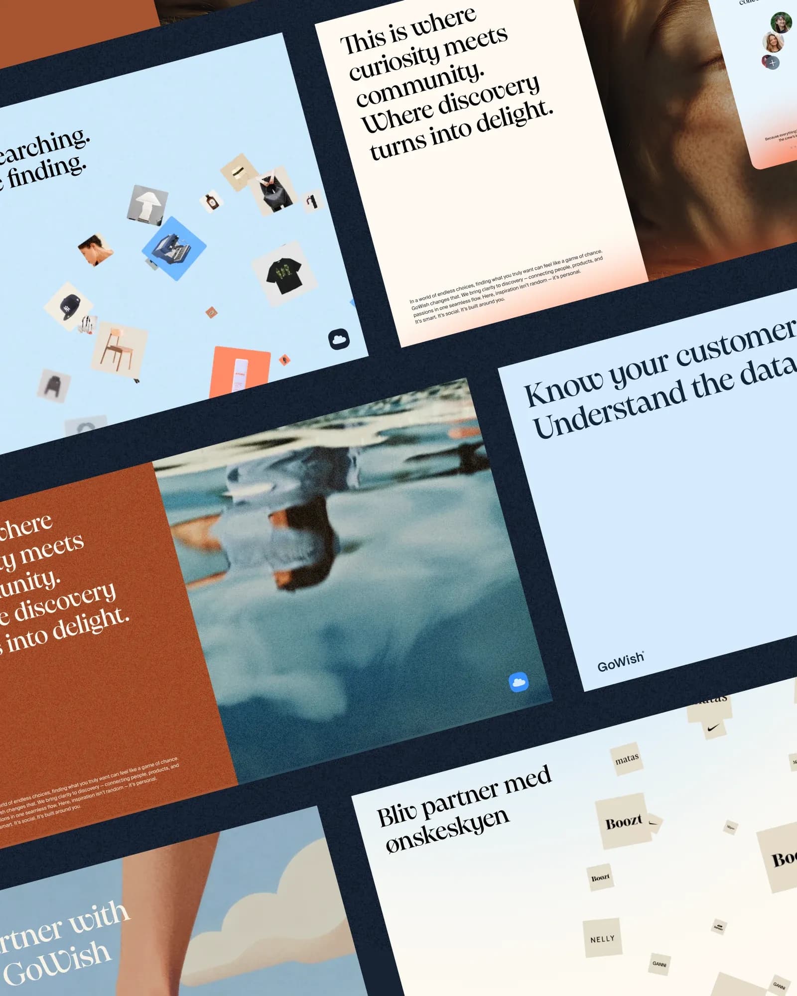
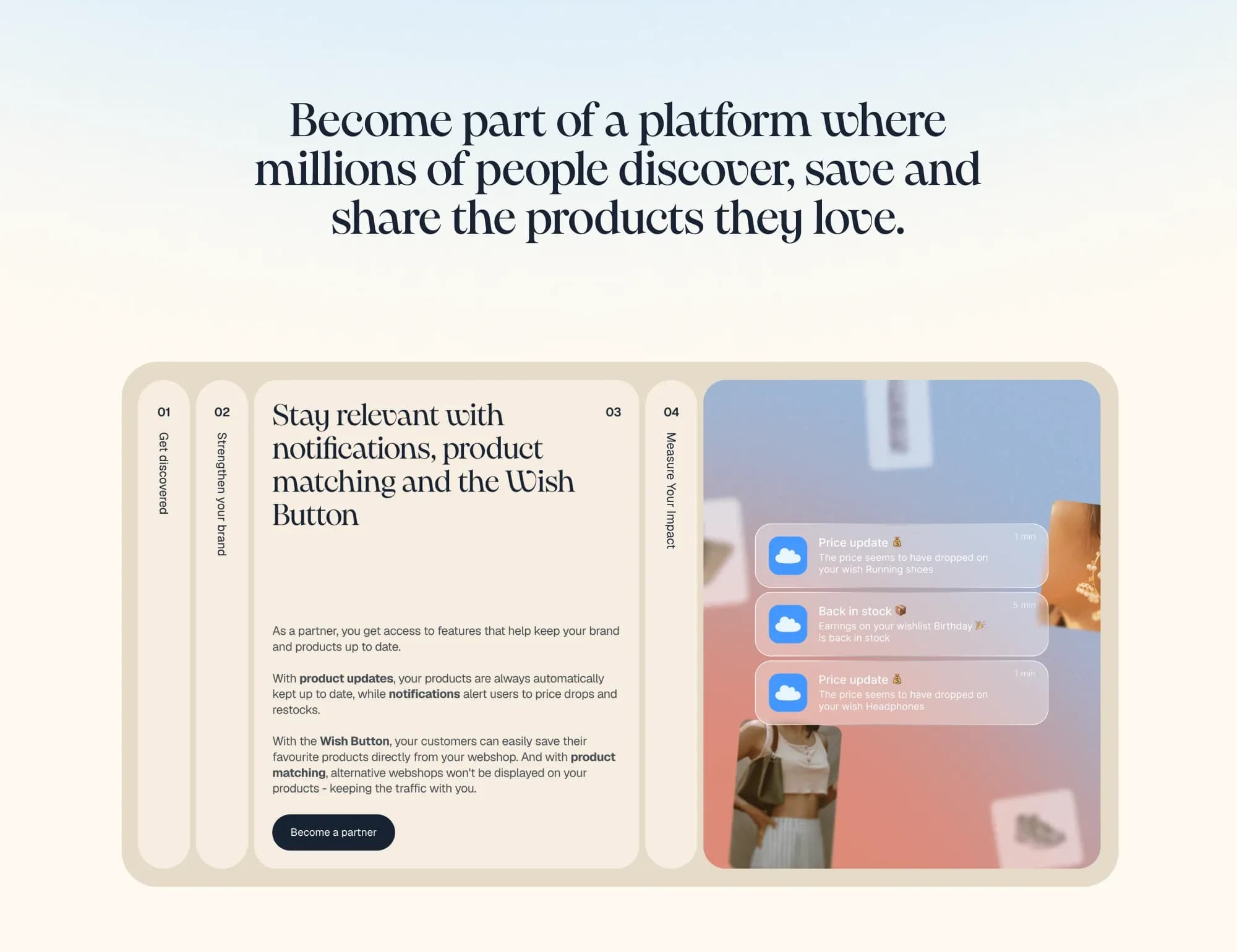
Each principle was given a defined role. Playful covers motion, vibrant accent colours, tactile elements and details such as the "blurry skies" backgrounds. Personal covers soft shapes and options for users to personalise the experience. Professional covers structured layouts, clear hierarchies and consistent communication across touchpoints.
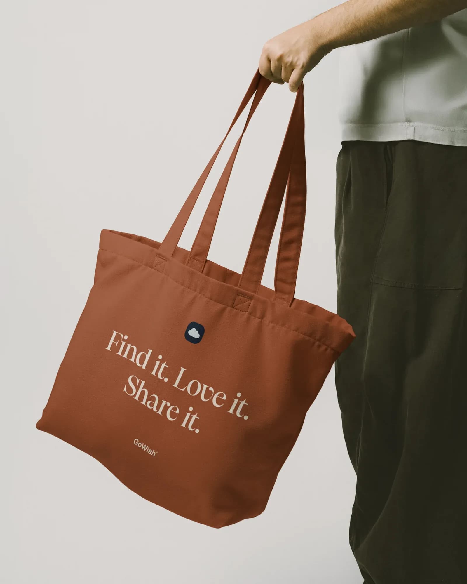
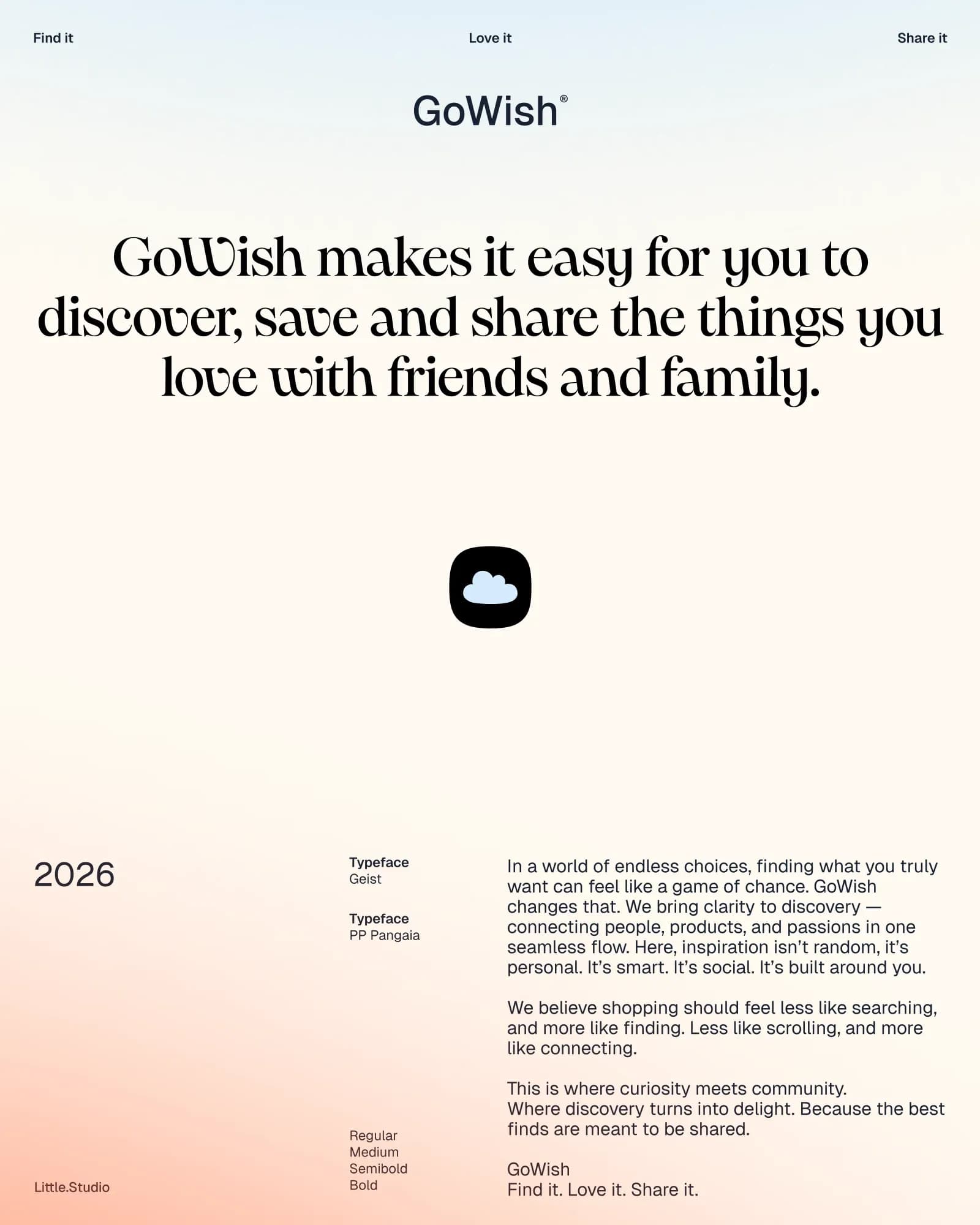
The logo refinement draws on soft cloud forms, and those forms carry into the interface. "The cloud gives the brand a soft shape language that can carry through into cards, icons and interface elements," says Laigaard. The typography pairs two typefaces: Geist for body text and PP Pangaia as the display font.
Users can choose a colour theme, limited to four colours within the brand's colour framework. "The principle is to let personal expression sit within the brand colour framework," says Laigaard.
Alongside the identity work, Little Studio prototyped motion concepts for onboarding, loading screens, navigation, wishlists, discovery and adding a wish, as well as partner communications and social content. "A lot of concepts never see the light of day," says Laigaard, "but in general prototypes serve as a layer to test ideas and build a more tangible narrative towards the client." The deliverable for GoWish's product and marketing teams was a brand toolbox, which Laigaard calls "a day-to-day framework to keep the brand consistent across the organisation."
“Giving the user the layer of colour control within four colours already gives a feeling of personalisation and ownership.”
Kasper Laigaard