IW Agency took a building apart for SSE's new visual identity
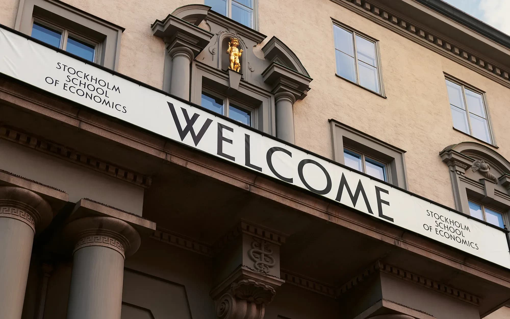
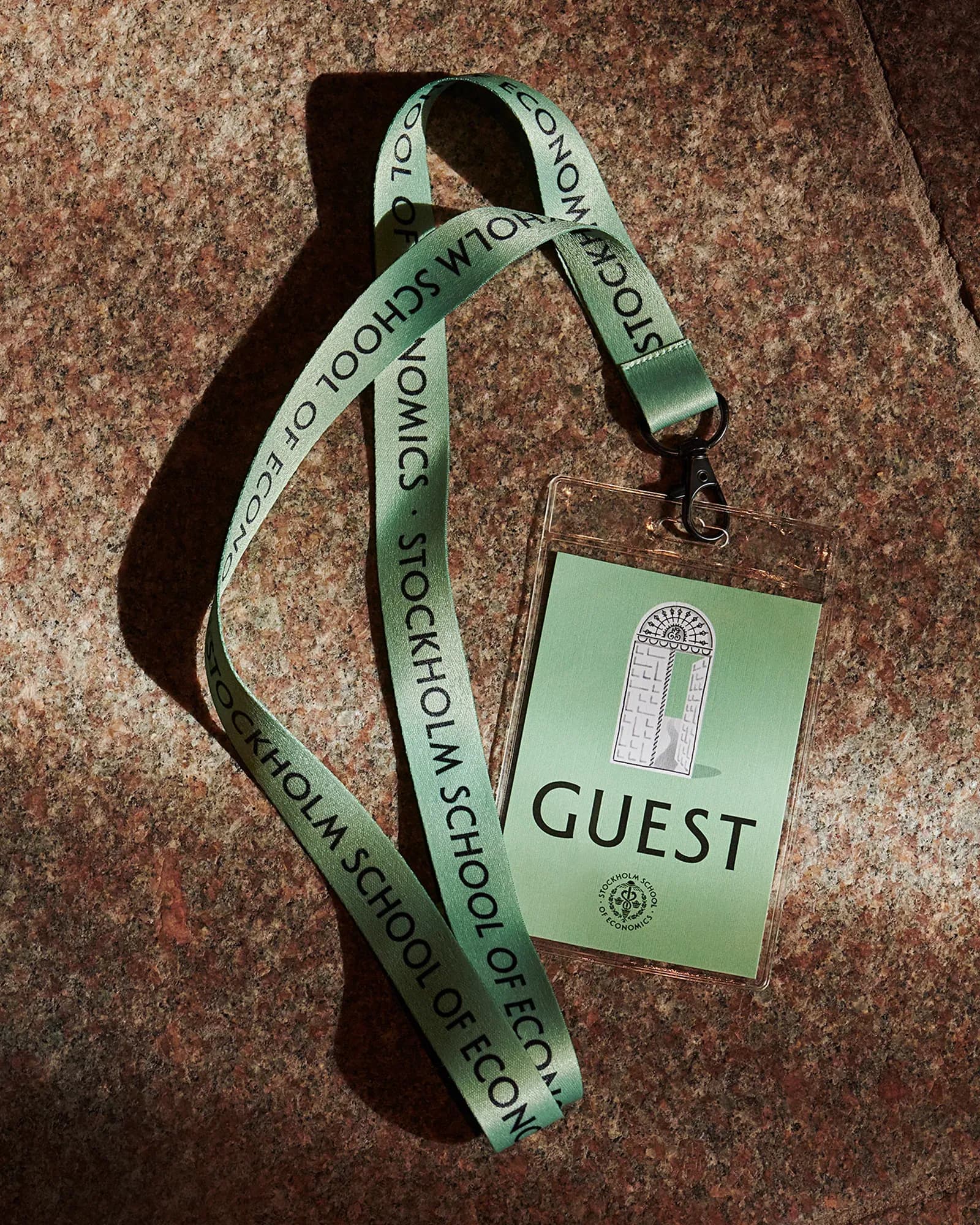
Excellence, ambition and leadership fit almost any business school, which makes them a weak foundation for an identity that has to be recognised as one school's. IW Agency developed the visual identity for the Stockholm School of Economics (SSE) by taking the school's own building on Sveavägen as the source for its typography, colours and illustrations. The building belongs to the Swedish Grace tradition, a 1920s Swedish classicism built on symmetry and classical proportions, and the identity treats every layout as a room.

Why the identity starts with the building
The brief asked for an identity that carries the authority of SSE's past and still reflects the school as it is today. IW Agency's starting point was the building rather than the category. "Ideas like excellence, ambition and leadership are relevant to almost every business school," says Tatjana Dubovina Jokić, Creative Director at IW Agency. "We wanted to start with something that could only belong to SSE. The building gave us a surprisingly rich world of details, symbols and characters."
The work began with looking. Dubovina Jokić describes it as "starting with observation rather than deciding on a style." The team went through the architecture, artworks, signage, materials and lettering, and the smaller details most people never register. "We also worked from the school itself for periods of time, to really absorb the atmosphere and understand how the place feels in use," she says.
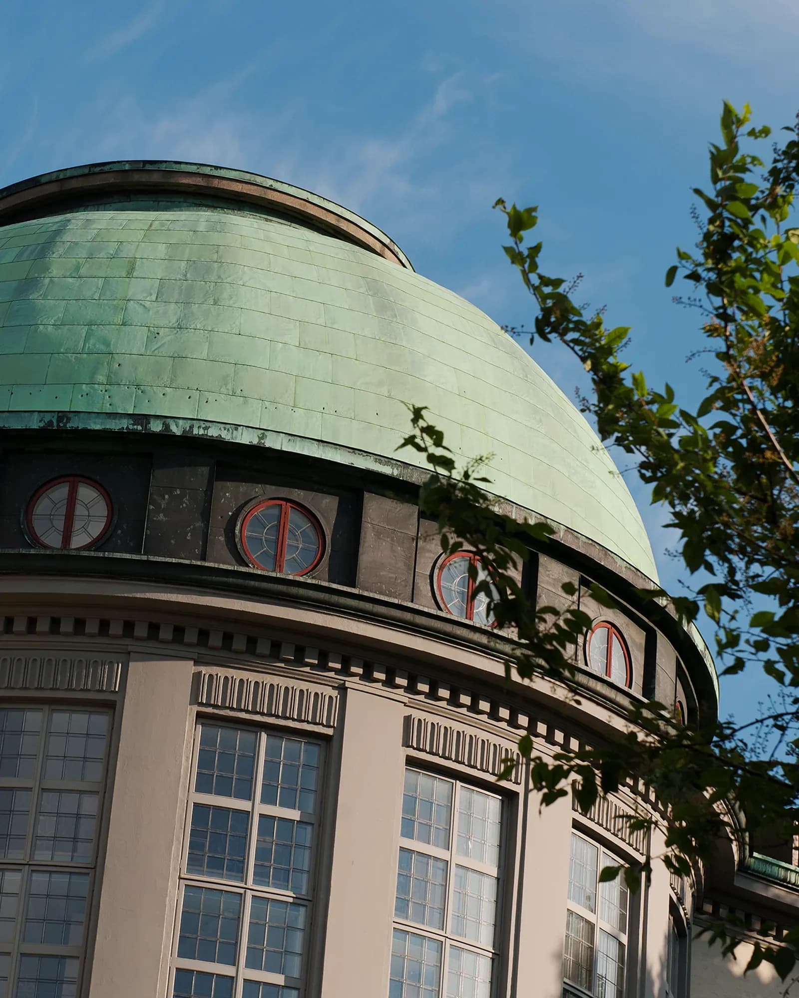
The team then had to decide which of these details would carry the identity. "We looked for details that felt distinctly SSE but also had potential to do something graphically," Dubovina Jokić explains. "Some were obvious, like the atrium lettering and the copper-green dome. Others came from contrasts we kept noticing like strict geometry next to ornament, and architecture next to art. That mix felt quite representative of SSE itself, academically serious, but with a strong cultural curiosity."
Anchoring an identity in one historic building carries a risk of reading as conservative or closed, particularly for an international school. Dubovina Jokić says the team avoided that by "not treating history as something sacred. We use it as material and put details into completely new relationships. Making it specific to the place without becoming exclusive." She adds that SSE did not need to become visually neutral to feel international: "The design should work without that knowledge, but the local references give it character and depth."

“If everything stayed too faithful to the architecture, the system would become static.”
Tatjana Dubovina Jokić, Creative Director at IW Agency
Turning architecture into illustration, type and colour
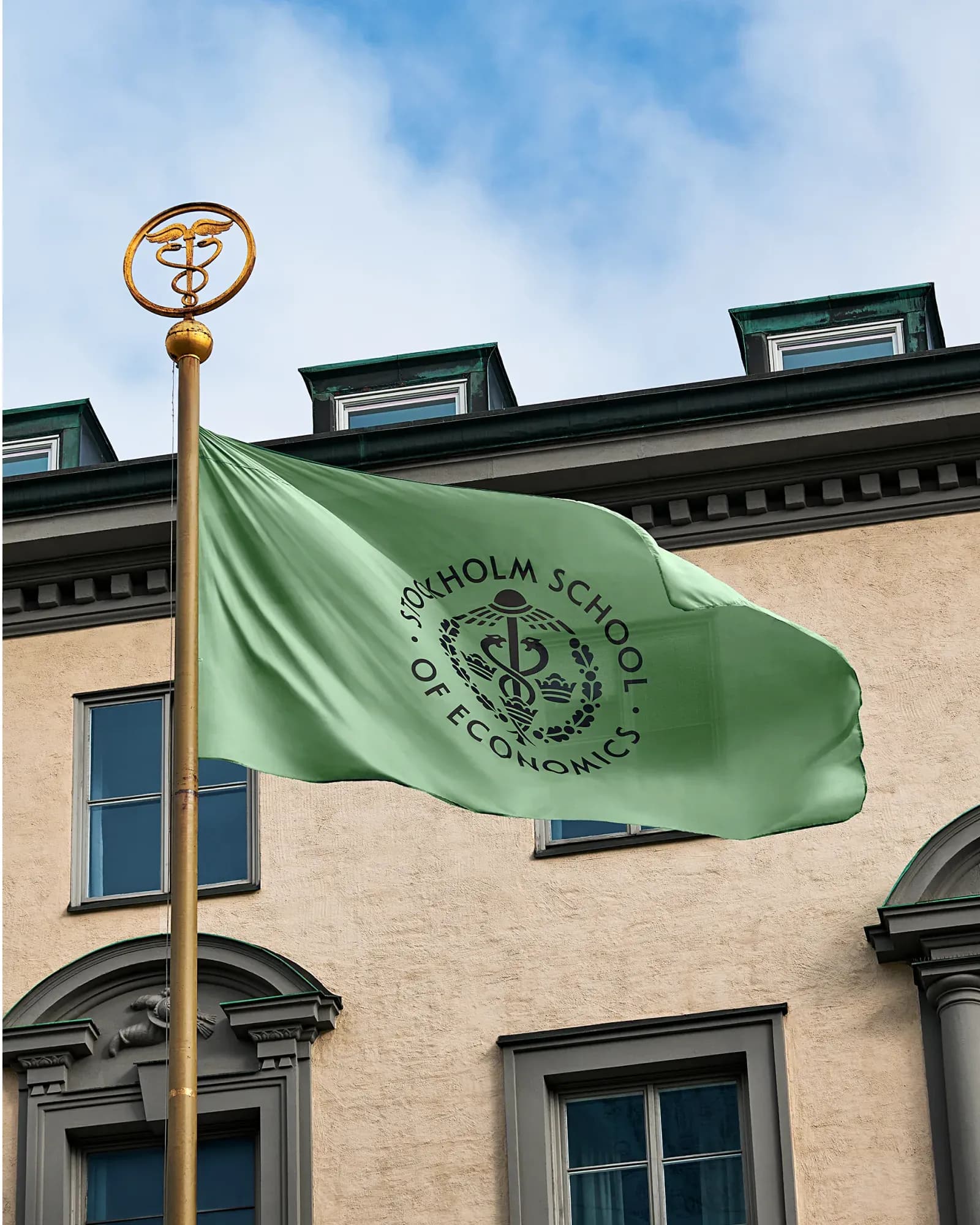
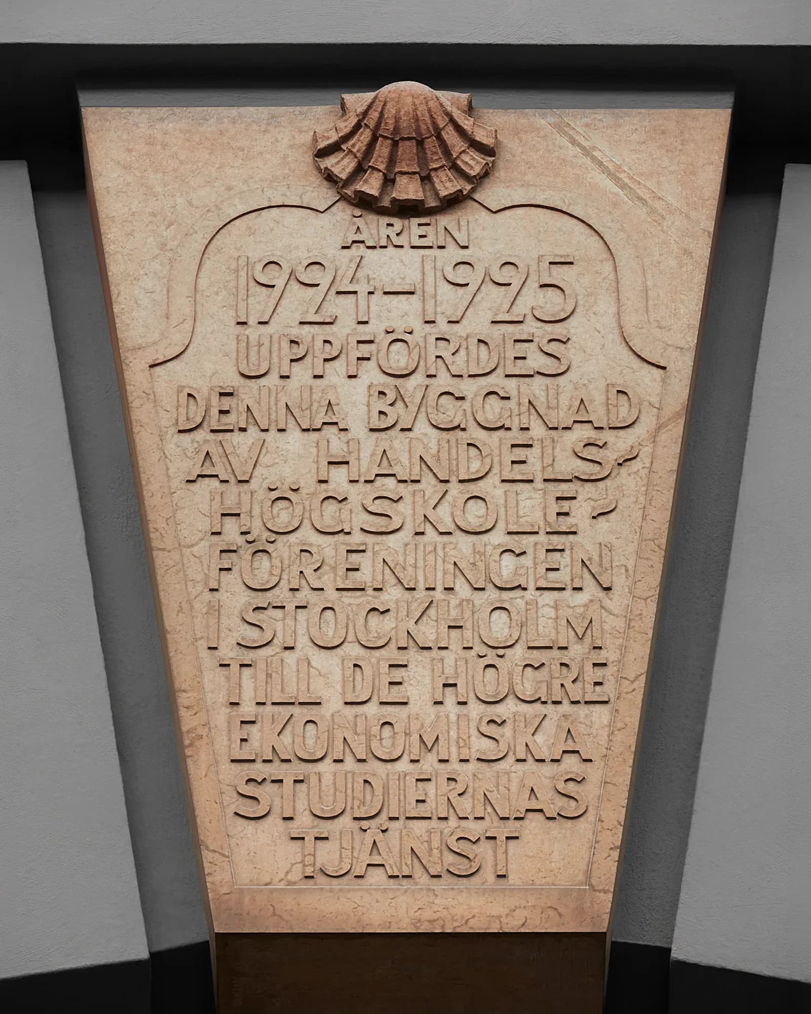
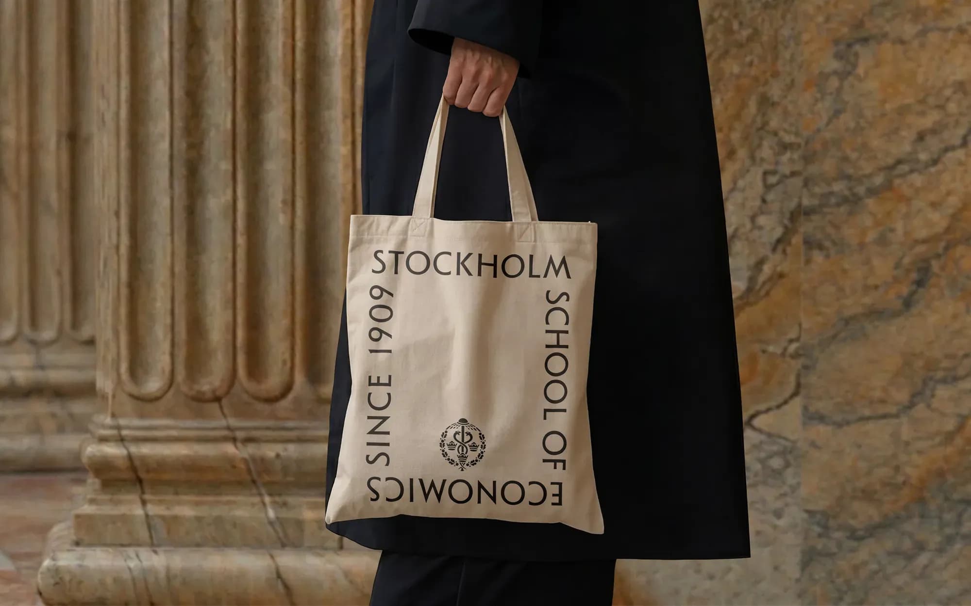
The same source runs through typography, colour and illustration. The typeface, SSE Adelia, refers to the stone inscription in the atrium, and the primary green is taken from the patinated copper dome of the library. Dubovina Jokić says this was a deliberate choice for the whole system: "We wanted the whole identity to grow from the place because SSE feels quite different from what you might expect when entering a business school. There is so much character in the architecture, art, materials and details, and we wanted the identity to capture that experience."
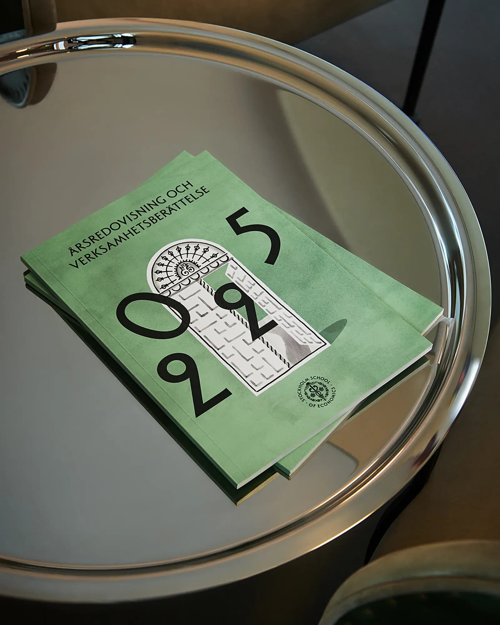
The illustrations are built from facade details, objects and surfaces. Architectural structures shape the compositions, and wall textures create "walls" on the page. IW Agency chose illustration over photography, and Dubovina Jokić explains why: "Illustration allowed us to interpret that world rather than just document it. A staircase, ornament or sculpture can change scale, interact with people or take on a completely new meaning."
Keeping the references recognisable without copying the building was the main balance in the work. "We used the architecture as a source, but avoided illustrating it too literally," she says. "Once we picked up a reference, we simplified, exaggerated or transformed it until it could work as a graphic element on its own. That distance was important. If everything stayed too faithful to the architecture, the system would become static. By loosening the references, they became more flexible and playful, with a bit of humour, while still feeling part of the same world."
In digital channels, many recipients have never been to the campus. For them, Dubovina Jokić says, the reference has to stand on its own: "The reference has to work as design before it works as a reference. Someone should be able to appreciate it without knowing where it came from. If they later visit SSE and recognise those connections, that becomes an additional layer." The digital formats also allow things the building cannot: "Things can move, change scale, shift perspective or be recombined. So rather than reproducing the physical environment, we can extend its character."
“Illustration allowed us to interpret that world rather than just document it.”
Tatjana Dubovina Jokić, Creative Director at IW Agency